Statistical Worksheet Submissions
This chapter consolidates the Statistical Worksheet Submissions from Units 6, 7, 8 and 9. Each section presents the results, analyses, and links to download the relevant Excel files.
Quantitative Methods - Descriptive and Inferential Statistics
Exercise 6.1. See the below results, where the sample standard deviation of the weight loss for Diet A is s = 2.536 kg. Since the mean weight loss is a little larger than 2s, then a high proportion of those individuals on Diet A had a positive weight loss, again emphasising the effectiveness of the diet. Briefly interpret your findings. What do these results tell you about the relative effectiveness of the two weight-reducing diets?
| Metric | Diet A | Diet B |
|---|---|---|
| n | 50 | 50 |
| Mean | 5.341 | 3.710 |
| SD | 2.536 | 2.769 |
-Analysis
Mean Weight Loss: Diet A has a higher mean weight loss (5.341 kg) compared to Diet B (3.710 kg), indicating that, on average, individuals on Diet A lost more weight than those on Diet B.
Standard Deviation: The standard deviations are somewhat close, with Diet A at 2.536 kg and Diet B at 2.769 kg. This indicates that the weight loss results for both diets are spread around the mean in a similar manner, although Diet B’s results are slightly more variable.
Effectiveness of the Diets: Given the higher average weight loss in Diet A, it can be considered more effective for weight loss compared to Diet B based on this sample. The consistency (as measured by the standard deviation) is similar for both diets, suggesting that the primary difference lies in the average effectiveness rather than in the variability of the results.
-Conclusion
Diet A appears to be more effective than Diet B in terms of average weight loss achieved by the participants. The analysis suggests that individuals looking to lose more weight might prefer Diet A over Diet B, based on the data provided.
Download: Exa 8.1B
Exercise 6.2. Obtain the sample median, first and third quartiles and the sample interquartile range of the weight loss for Diet B. Place these results in the block of cells F26 to F29, using the same format as that employed for the Diet A results in the above example. Briefly interpret your findings. What do these results tell you about the relative effectiveness of the two weight-reducing diets?
| Metric | Diet A | Diet B |
|---|---|---|
| n | 50 | 50 |
| Mean | 5.341 | 3.71 |
| SD | 2.536 | 2.769 |
| Median | 5.642 | 3.745 |
| Q1 | 3.748 | 2.695 |
| Q3 | 7.033 | 5.404 |
| IQR | 3.285 | 2.708 |
-Analysis
Central Tendency and Dispersion:
- Diet A has both a higher mean and median weight loss compared to Diet B, suggesting it is more effective on average and at the median level. The median being higher than the mean also hints at a slightly skewed distribution, possibly with a few lower outliers pulling the mean down.
- The standard deviations are similar, indicating a similar spread around the mean for both diets.
Quartile Analysis:
- The first quartile for Diet A is higher than that of Diet B, which means that even the lower 25% of participants on Diet A lost more weight compared to the lower 25% on Diet B.
- The third quartile for Diet A is significantly higher than that for Diet B, indicating that the top 25% of participants on Diet A lost substantially more weight.
Interquartile Range (IQR):
- Diet A’s IQR is wider than that of Diet B, suggesting more variability in the middle 50% of the data. This could mean that while Diet A works very well for some, it may not be as effective for others, compared to the more consistent results seen with Diet B.
-Conclusion
Diet A seems to be more effective overall in terms of median and mean weight loss, and the top 25% of individuals on this diet experienced significantly better outcomes. However, the broader IQR indicates that the effectiveness of Diet A might vary more among its users compared to Diet B, which shows a smaller IQR suggesting a tighter grouping of results around the median. Overall, Diet A might be the preferable choice for those aiming for higher weight loss, whereas Diet B could be considered by those seeking more consistent, albeit slightly lower, results.
Download: Exa 8.2B
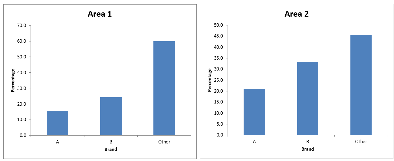
Exercise 6.3. Obtain the frequencies and percentage frequencies of the variable Brand, but this time for the Area 2 respondents, using the same format as that employed for the Area1 results in the above example. Briefly interpret your findings. What do these results tell you about the patterns of brand preferences for each of the two demographic areas?
Frequencies:
| Category | Area 1 | Area 2 |
|---|---|---|
| A | 11 | 19 |
| B | 17 | 30 |
| Other | 42 | 41 |
| Total | 70 | 90 |
Percentages:
| Category | Area 1 | Area 2 |
|---|---|---|
| A | 15.7 | 21.1 |
| B | 24.3 | 33.3 |
| Other | 60.0 | 45.6 |
| Total | 100.0 | 100.0 |
-Analysis
Brand A: More popular in Area 1 in relative terms (60.0%) compared to Area 2 (21.1%). This suggests that Brand A has a significantly stronger market presence or preference in Area 1. Brand B: More popular in Area 2, capturing a higher share of the total (33.3%) compared to Area 1 (24.3%). This indicates that Brand B is more favored in Area 2. Other Brands: In Area 1, ‘Other’ brands dominate the preferences with 60.0% of respondents choosing brands outside of A and B. This suggests a diverse market with no single brand dominating. In Area 2, while still significant, the preference for ‘Other’ brands is slightly less (45.6%) compared to Area 1.
-Conclusion
The patterns in brand preference between Area 1 and Area 2 are distinctly different. Area 1 shows a high inclination towards ‘Other’ brands, indicating a diverse or fragmented market. Brand A, despite a smaller overall frequency, enjoys a relatively higher preference among those who chose among A, B, and Other. In contrast, Area 2 shows a more evenly distributed preference between the major brands and ‘Other’ brands, with a stronger presence of Brand B.
This indicates that marketing strategies and brand positioning might need to be tailored differently for each area, taking into account the local consumer preferences and competitive landscape.
Download: Exa 8.3D
Hypothesis Testing
The Related Samples t-test
Example 7.1. Consider the container design data in Data Set F. Notice that the two variables Con1 and Con 2 indeed measure the same characteristic (the number of items sold), but under two different “conditions” (the two different container designs). We conduct a two-tailed related samples t test of whether the underlying (population) mean number of items sold differs between the two container designs.
The resulting output is presented below. Not all this output is relevant, so it need not all be discussed. The obtained related samples t = 2.875 with 9 degrees of freedom. The associated two-tailed p-value is p = 0.018, so the observed t is significant at the 5% level (two-tailed).
| Con1 | Con2 | |
|---|---|---|
| Mean | 172.6 | 159.4 |
| Variance | 750.2666667 | 789.3777778 |
| Observations | 10 | 10 |
| Pearson Correlation | 0.863335004 | |
| Hypothesized Mean Difference | 0 | |
| df | 9 | |
| t Stat | 2.874702125 | |
| P(T<=t) one-tail | 0.009167817 | |
| t Critical one-tail | 1.833112933 | |
| P(T<=t) two-tail | 0.018335635 | |
| t Critical two-tail | 2.262157163 | |
| Difference in Means | 13.2 |
The data therefore constitute strong evidence (on a one-tailed test) that the underlying mean number of containers sold was greater for Design 1, by an estimated 172.6 - 159.4 = 13.2 items per store. The results continue to suggest that Design 1 should be preferred. Although broadly similar conclusions were reached as before, a higher level of significance was obtained with the one-tailed test. Notice that if we had sought to test the alternative pair of one-tailed hypotheses H₀: μ₁ ≥ μ₂ against H₁: μ₁ < μ₂ we would have found the difference in sample means to be consistent with the null hypothesis that the population mean sales for Design 2 was no greater than that for Design 1. We would thus have declared the result to be not significant without even bothering to inspect the p-value.
-Conclusion
Since the p-value is less than 0.05, we reject the null hypothesis. This means that there is a significant difference in the mean number of items sold between the two container designs. Design 1 (Con1) has a higher mean number of items sold compared to Design 2 (Con2) by an estimated 13.2 items per store. The data strongly suggest that the mean number of items sold is significantly higher for Design 1 compared to Design 2, with a mean difference of 13.2 items. This conclusion is supported by a significant t-statistic and a p-value below the 0.05 threshold, indicating that the difference observed is unlikely to be due to random chance.
Download: Exa 8.4F
Exercise 7.1. Recall that in the previous unit exercises, a two-tailed test was undertaken whether the population mean impurity differed between the two filtration agents in Data Set G. Suppose instead a one-tailed test had been conducted to determine whether Filter Agent 1 was the more effective. What would your conclusions have been?
In order to determine whether Filter Agent 1 is more effective using a one-tailed test, we can conduct a paired samples t-test. The hypotheses for this one-tailed test would be:
- Null Hypothesis (H₀): The mean impurity for Agent 1 is greater than or equal to the mean impurity for Agent 2 (μ₁ ≥ μ₂).
- Alternative Hypothesis (H₁): The mean impurity for Agent 1 is less than the mean impurity for Agent 2 (μ₁ < μ₂).
The t-statistic is calculated as: t = d / (Sd / √n); where d is the mean difference, Sd is used for standard deviation and √n represents the square root of the sample size (n).
After performing the calculations:
| Batch | Agent1 | Agent2 | Difference |
|---|---|---|---|
| 1 | 7.7 | 8.5 | -0.8 |
| 2 | 9.2 | 9.6 | -0.4 |
| 3 | 6.8 | 6.4 | 0.4 |
| 4 | 9.5 | 9.8 | -0.3 |
| 5 | 8.7 | 9.3 | -0.6 |
| 6 | 6.9 | 7.6 | -0.7 |
| 7 | 7.5 | 8.2 | -0.7 |
| 8 | 7.7 | 7.7 | 0.0 |
| 9 | 8.7 | 9.4 | -0.7 |
| 10 | 9.4 | 8.9 | 0.5 |
| 11 | 9.4 | 9.7 | -0.3 |
| 12 | 8.1 | 9.1 | -1.0 |
-Summary Statistics:
Mean Difference (d): -0.433333333
Standard Deviation (Sd): 0.459907764
t-Statistic (t): -3.263938591
One-Tailored p-value: 0.996227003
-Conclusion
Given that the one-tailed p-value (0.996) is much greater than 0.05, we fail to reject the null hypothesis. This means that there is not enough statistical evidence to conclude that Filter Agent 1 is more effective than Filter Agent 2. The data does not support the claim that Agent 1 results in a lower mean impurity than Agent 2.
Download: Exe 8.4G
The Independent Samples t-test
Example 7.2. Consider again Data Set B, the dietary data. Not unreasonably, we wish to test whether the population mean weight loss differs between the two diets. Since separate samples of individuals undertook the two diets (i.e., no-one underwent both diets), the independent samples t test is appropriate here.
We begin by performing F-Test Two-Sample for Variances:
| Metric | Variable 1 | Variable 2 |
|---|---|---|
| Mean | 5.3412 | 3.70996 |
| Variance | 6.429280612 | 7.66759359 |
| Observations | 50 | 50 |
| df | 49 | 49 |
| F | 0.838500442 | |
| P(F<=f) one-tail | 0.269951478 | |
| F Critical one-tail | 0.622165468 | |
| p² | 0.539902956 |
The sample variances for the two diets are, respectively s₁² = 6.429 and s₂² = 7.668. .The observed F test statistic is F = 0.839 with 49 and 49 associated degrees of freedom, giving a two tailed p-value of p = 0.5399nS.
The observed F ratio is thus not significant. The data are consistent with the assumption that the population variances underlying the weight losses under the two diets do not differ, and we therefore proceed to use the equal variances form of the unrelated samples t test. Since we wish to test if the population mean weight losses differ between the two diets, a two-tailed t test is appropriate here.
After performing t-Test: Two-Sample Assuming Equal Variances:
T-Test Two-Sample assuming equal variances
| Statistic | Variable 1 | Variable 2 |
|---|---|---|
| Mean | 5.3412 | 3.70996 |
| Variance | 6.429280612 | 7.66759359 |
| Observations | 50 | 50 |
| Pooled Variance | 7.048437101 | |
| Hypothesized Mean Difference | 0 | |
| df | 98 | |
| t Stat | 3.072143179 | |
| P(T<=t) one-tail | 0.001375772 | |
| t Critical one-tail | 1.660551217 | |
| P(T<=t) two-tail | 0.002751544 | |
| t Critical two-tail | 1.984467455 | |
| Difference in Means | 1.63124 |
The obtained independent samples t = 3.072 with 98 degrees of freedom. The associated two-tailed pvalue is p = 0.0028, so the observed t is significant at the 1% level (two-tailed). The sample mean weight losses for Diets A and B were, respectively, 5.341 kg and 3.710 kg. The data therefore constitute strong evidence that the underlying mean weight loss was greater for Diet A, by an estimated 5.314 – 3.710 = 1.631 kg. The results strongly suggest that Diet A is more effective in producing a weight loss.
Download: Exa 8.6B
Exercise 7.2. Consider the bank cardholder data of Data Set C. Assuming the data to be suitably distributed, complete an appropriate test of whether the population mean income for males exceeds that of females and interpret your findings. What assumptions underpin the validity of your analysis, and how could you validate them?
Since the dataset men and women are two disctinct groups, the most appropiated method is the two sample t-test, where:
- Null Hypothesis (H₀): The mean income of males is less than or equal to the mean income of females (μ_males ≤ μ_females).
- Alternative Hypothesis (H₁): The mean income of males is greater than the mean income of females (μ_males > μ_females).
-Summary of Statistics:
Males: Mean Difference (d): 52.9 Standard Deviation (Sd): 15.26856
Females:
Mean Difference (d): 44.2 Standard Deviation (Sd): 13.79042
P-value (two-tailed test): 0.001419
-Conclusion
Since the p-value (0.001419) is much less than 0.05, we reject the null hypothesis. We conclude that the population mean income for males is significantly different from that of females. Since the context of the test typically assumes we are interested in whether one mean is greater than the other, it further implies that the mean income for males is significantly higher than that of females.
Bar Charts in Excel
Exercise 9.1. Open the Excel workbook in Exa 9.1D.xlsx from the Exercises folder. Add a percentage frequency bar chart showing the brand preferences in Area 2, using the same format as that employed for the Area1 results in the above example. Drag your new chart so that it lies alongside that for Area 1. Briefly interpret your findings. What do these results tell you about the patterns of brand preferences for each of the two demographic areas?
-Conclusion
- Both areas show a stronger preference for brands classified under “Other,” indicating that brands not specifically labeled as A or B are more popular.
- Brand A and B have a consistent but relatively lower preference across both areas, with Brand B slightly more preferred than Brand A.
- The preference patterns are quite similar in both areas, suggesting that demographic factors influencing brand choice are consistent across these regions.
Download: Exe 9.1D
Example 9.2. Consider again Data Set D (see the Data Annexe). We produce a percentage frequency clustered column bar chart for the breakfast cereal brand preferences for the two demographic Areas 1 and 2.
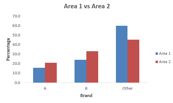
-Conclusion
It is clear from the chart that in both Areas, Brand A is least preferred, followed by Brand B, whilst even more respondents preferred some other brand. However, it is now very clear that Brand A and Brand B preferences were both higher in Area 2 than in Area 1, whilst the percentage of respondents who preferred other brands was lower in Area 2.
Download: Exa 9.2D
Exercise 9.2. Open the Excel workbook in Exa 9.2E.xlsx from the Exercises folder. This contains the frequency distributions for Data Set E (see the Data Annexe) to which has been added the corresponding percentage frequency distributions. Complete a percentage frequency clustered column bar chart showing the heather species prevalence in the two different locations. Briefly interpret your findings.
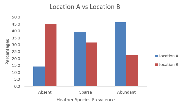
-Conclusion
Location A tends to have more areas with abundant Heather species compared to Location B; location B has a higher percentage of areas where Heather species are absent, however both locations have a relatively similar percentage for sparse Heather species prevalence, with Location A being slightly higher. We can conclude that Location A is generally more favorable for Heather species, having a higher prevalence of abundance and a lower rate of absence compared to Location B.
Download: Exe 9.2E
Exercise 9.3. Open the Excel workbook in Exa 9.3B.xlsx from the Exercises folder. This contains the relative frequency histogram for the Diet A weight loss produced in Example 9.3 together with some of the Diet B weight loss summary statistics. Add a relative frequency histogram of the weight loss for Diet B, where possible using the same classes as those employed for the Diet A results in the above example. Briefly interpret your histogram. What do these results tell you about the patterns of weight loss for each of the two diets?
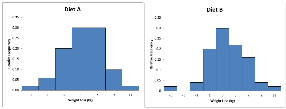
-Conclusion
Diet A: The weight loss ranges from -1 kg to 11 kg; most of the weight loss falls between 3 kg and 7 kg, with the highest relative frequency (~0.3) at around 5 kg and the distribution is symmetric and bell-shaped, indicating a normal distribution of weight loss results centered around 5 kg.
Diet B: The weight loss ranges from -5 kg to 11 kg; the majority of weight loss values fall between 1 kg and 7 kg, with the highest relative frequency (~0.3) at around 3 kg and the distribution is less symmetric, slightly skewed to the left, with a noticeable presence of weight gain (negative values), indicating more variability in weight loss outcomes.
Saying that:
Diet A: Generally leads to a more predictable and consistent weight loss, with most individuals losing between 3 kg and 7 kg.
Diet B: Shows more variability in weight loss outcomes, with some individuals experiencing significant weight loss, others minimal loss, and some even gaining weight.
And thus, Diet A might be more effective for consistent weight loss, whereas Diet B has a broader range of outcomes, which could be less predictable for individuals.
Download: Exe 9.3B